I want to talk to you about some buildings.
You may or may not know this about me, depending on how you’ve come to this newsletter, but in my daily, non-internet life, I’m an architect.
Wait, stay — no, I don’t like the way most architects write about architecture either. There’s a great deal of pretension, of empty theory and academic word salad, of trying to prove that you’re smarter than your reader by making what you’re saying utterly inscrutable. It’s never appealed to me and I suspect it doesn’t appeal to you.
I want to talk about a handful of buildings I’ve experienced in my life, and things they’ve meant to me, in ways either large or small.
First, I want to talk to you about a terrible building.
The University of Cincinnati, nestled on a tight superblock in a dense old neighborhood, has spent the last three decades collecting architecture by some of the world’s most renowned architects. It was conscious move, set forth in a 1991 campus master plan, intended to transform a dowdy urban commuter school into a distinct destination. Star-chitects like Frank Gehry, Michael Graves, Peter Eisenman and Thom Mayne were brought in to shape an eclectic vision of the campus of the future. Largely, they succeeded — a campus defined by blocky, utilitarian post-war buildings and massive surface parking lots slowly gave way to an integrated fabric, weaving sculpted ribbons of green space through a parade of architectural wonders.
And then there’s Crosley Tower.

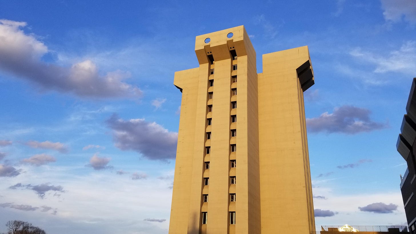
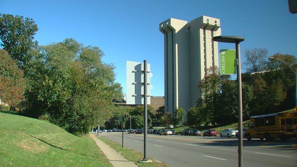
Built in 1969 to house the university’s growing Chemistry department, Crosley Tower looms over the northwest corner of the campus like a cartoon supervillain’s lair. It’s a massive, sheer slab of blank concrete sixteen stories high, the only ornamentation a slight flaring at the top supposedly intended to recall classical column capitals but more reminiscent of the feet of upturned Lego mini-figurines.
To call it a blight would be to both undersell and misrepresent its aesthetic statement. For one, blight implies a sense of decay, a once-grand building weathered by age and disuse. While the building indeed has weathered poorly in its half-century of existence, its general appearance is much the same as the day it was built. And this design was no accident, but rather a bold statement of new building technology.
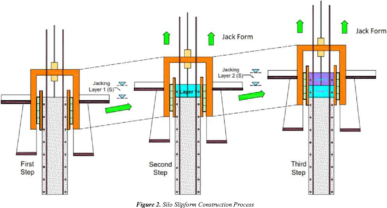
When using concrete as a major building element, the most costly and time-consuming aspect of the project is formwork — the molds, usually wood or metal, that the concrete is poured into. When building tall, it can be a laboriously slow process of assembling the forms, pouring, waiting for the concrete to cure, disassembling them, moving up, and repeating. In the early 20th century, a process was created to simplify, streamline, and speed up this process — slip-form construction.

Slip-form construction, in short, involves a continuous pour of concrete through a single form that’s slowly jacked up as the building rises. Think of a Play-Doh extruder, but on a skyscraper scale. For the first half of the century, it was primarily used for utilitarian constructions — grain silos, communication towers, elevator cores, and the like. As modernist architect dallied into Brutalism, though, the use of the process to build an entire occupiable building was inevitable.
The building’s sheer, featureless facade, barely interrupted by narrow columns of tiny windows, is an expression of the this process — a single, uninterrupted pour of concrete, purportedly the second-largest single pour of concrete worldwide (if you ask the university), behind only Hoover Dam. (I suspect this fact is not entirely up-to-date given the number of massive public works projects in the developing world, but we can accept this: it’s a whole freaking lot of concrete.) It was a genuine marvel when it was completed, worthy of superlatives other than the ones it would eventually earn, like, “one of America’s ugliest university buildings”.
Every college campus has its own set of folklore, a handful of urban legends passed down from generation to generation, usually the same ones on every campus.
Did you know the squirrels here are different?
Did you know they forgot to account for the weight of the books when they built the library, and now it’s sinking?
Did you know that if you walk by (campus landmark) when you’re a virgin, (thing that is physically impossible to happen but you’d never admit that you proved it wrong because you’re definitely not still a virgin in college haha what if but no not me) will happen?
At the University of Cincinnati, where I went to school, Crosley Tower is naturally the center of much of this folklore, owing to its age, prominence — it can be seen from much of campus — and its sheer ridiculousness.
A construction worker fell in when they were pouring, but they couldn’t stop, and he’s buried within the walls.
No, actually, they dropped a Volkswagen in when they were pouring, and it’s still in there.
They forgot to put restrooms in when they built it, so they had to put them in the stairwells.
(The restrooms are in the stairwells, but this was a conscious design decision.)
The building is sinking, and the whole thing might fall over soon.
They would’ve demolished it years ago, but they don’t know how to.
Most of those are false. That last one is somewhat close to true.
Recently, the university has stated that demolition is coming for the building in the next five to ten years, owing both to its functional inflexibility as a modern classroom building, and to the chunks of concrete that have occasionally crumbled from the facade to the sidewalks below. They haven’t specified how that demolition might take place. Pinched between a still-viable science department building and busy Martin Luther King Drive, it’s difficult to envision how this massive rock of a building might be taken down. Piece by piece or in one massive implosion, it will be a stubborn stump to uproot.

I hated the building when I first began attending class in the architecture building which it casts into morning shadow. It’s drab, foreboding, and lifeless, a thumb in the eye to the things I thought I’d be learning to do next door. The buildings I dreamed of were airy, dynamic in form, complex in appearance.
Over the years, I developed a grudging appreciation for it. The way the light hits at sunset on a bright day, lighting the facade like a sheer face of El Capitan. The sheer novelty of the thing itself, a building so ugly you couldn’t help but feel a fondness for it, like an embarrassing sibling. The view from the rooftop the night a classmate told me you could jar the locked stairwell door open with a good shoulder-check, a sweeping panorama of the city’s rolling hills and waterfront lights from a maintenance platform with no railings where I quaked like a leaf.
Architects like to believe that they’re sculpting the future — we had some contentious and honestly really quite annoying debates about this in grad-school theory classes — but in reality, they’re simply capturing the present. When Crosley Tower was poured into place, it didn’t capture a mason or a Volkswagen in its walls, but it did capture the way we thought a half-century ago, the things society valued. Expedience. Cleverness. Simplicity and scale, unsubtlety and power. It’s a window into the world we were the year we landed on the moon and probably thought we’d still be going back now.
Perhaps in fifty years the buildings we’re making today will tell a different story, tell future generations what we prized.
If we want them to be around to tell that story, maybe we should make them really hard to knock down.
— Scott Hines (@actioncookbook)


